Design Overview
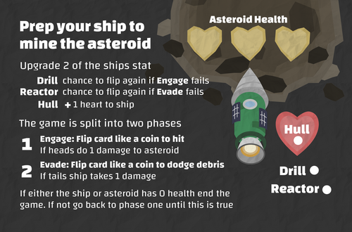
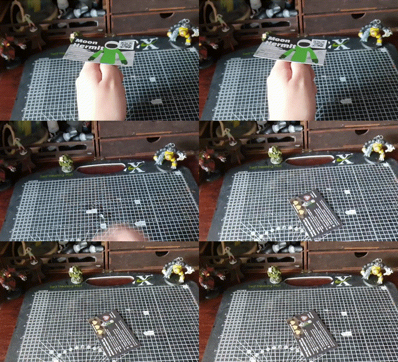
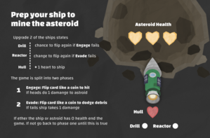
Soon to be exhibiting Seal Ordeal at the 2023 Falmouth Game Academy Expo I used it as an opportunity to design a business card game, inspired by other designers doing the same. Working on this game was a unique challenge that forced me to work under constraints I'd never encountered before. It forced me to focus on perfecting the "UI" cramming as much concise information within as small an area as possible.
Design Intentions
My goal was to create an as simple as possible game that anyone could play without prior game experience. I also wanted to avoid the need for additional elements such as dice to give as little barrier to play as possible, increasing the likelihood of people playing the game. Above all else, the game needed to be memorable to serve its purpose as a networking tool which was another motivator for making the game as easy to play as possible.
Constraints
- The game must fit on a business card.
- The game must be entirely contained on the back of the card so the front could function as a normal business card.
- The card must be the only item needed to play the game, so no using dice for example.
Card Flipping and Upgrades
The card-flipping mechanic came about as a way to introduce randomness to the game a simple coin flip to decide an outcome (something else I'd been interested in trying for a while). Though coin flips can only ever be a 50/50, one or the other, making for very little player agency or possibility space. It is, for this reason, that I implemented the upgrade system, allowing players to make two simple choices to affect their odds, giving them a chance to reroll on failed checks allowed them to assert themselves into the game.
Designing the "UI"
One of the greatest challenges of this project was cramming all the information needed onto the back of the small card. I needed to concisely teach players how to play the game without needing help from me. Playtesting was an essential part of this. The game went through many iterations each informed by playtests from both new and old testers.
By far the issue that came up most was the text being too small for some players to read, this problem would show itself time and time again, each time reducing the amount of room I had to work with forcing me to reduce the instructions further and further.
Another problem I kept encountering was players not understanding how the game worked. I had originally assumed that the rules such as the turn structure were pretty self-explanatory, (likely a result of being too close to the game) yet repeatedly it was shown that the game wasn't as straightforward as I'd assumed. In the end, I decided to walk the player through the game step by step which greatly improved the player's ability to comprehend the rules.
Conclusion
This was a fascinating and inciteful project to work on, the game's simplicity allowed for fast iterations and many playtests. This allowed me to learn tonnes about how I can take playtest data and use it to make meaningful changes for the player. That said this game is far from perfect, personally, I don't like how player agencies stop after assigning the upgrade points, and some players still struggle to understand the game rules by no fault of their own. Yet with all that said for my first try at creating something like this I am very happy with the result, while I do not think I will iterate on this specific project any further I am looking forward to tackling similar ones with the knowledge and experience Astromine to back me up.
Files
Get Asteromine (A game on a business card)
Asteromine (A game on a business card)
A micro game designed for the back of a business card
| Status | Released |
| Category | Physical game |
| Author | Moon Hermit |
| Tags | One-page |
Leave a comment
Log in with itch.io to leave a comment.